myKU UX Redesign
My UX redesign for my college's course selector and manager, myKU, which was almost always described by its users as some variant of confusing. Through research, wireframes, personas, and user testing on prototypes, I was able to improve on clarity and user friendliness to make a prototype user testers found much more functional.
See The Full Process

Process
Initial Process Flow of Existing Site
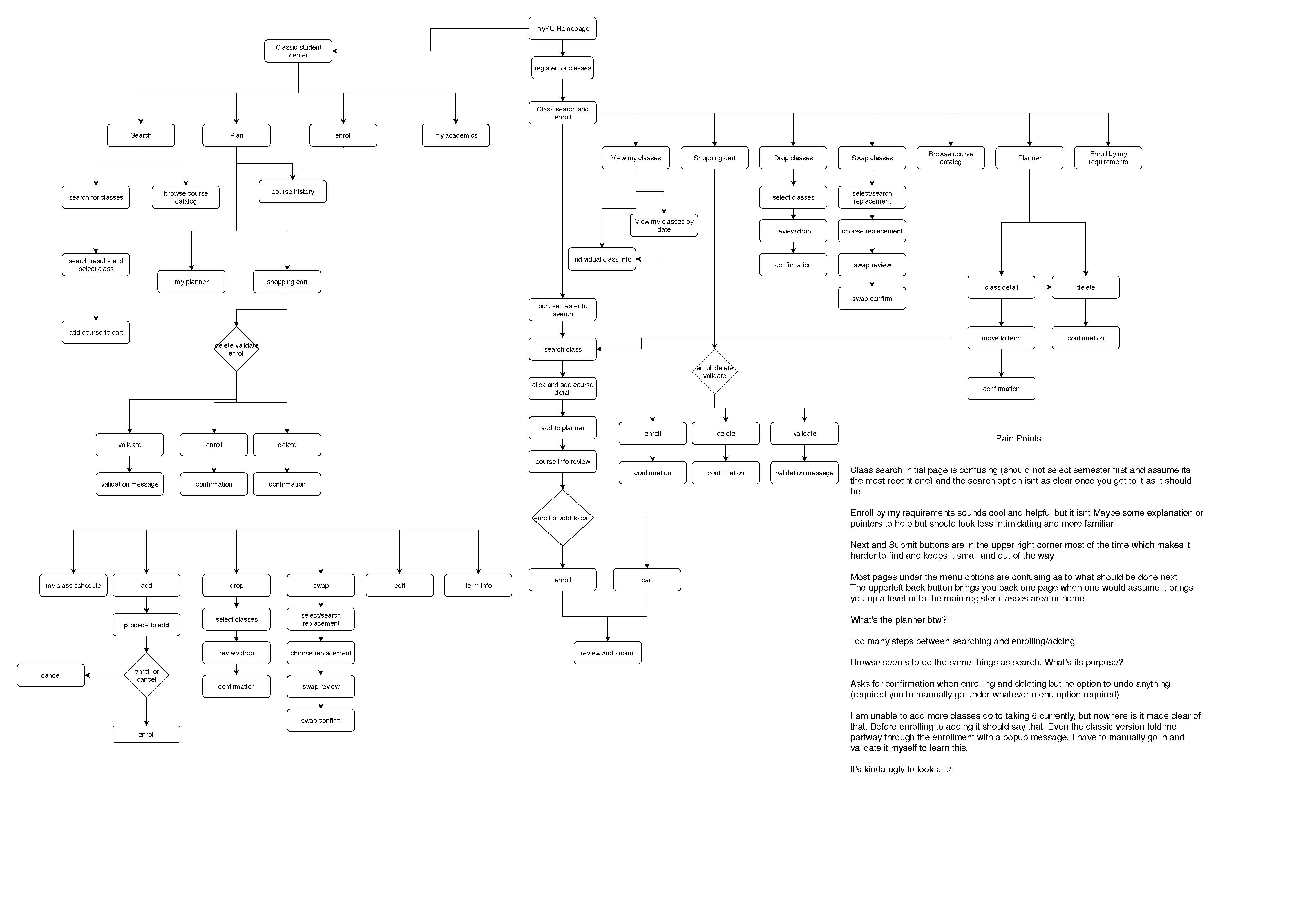
Class search initial page is confusing (you should not have to select semester first, but assume its the most recent one), and the search option isn't as clear once you get to it as it should be.
Enroll by my requirements sounds cool and helpful but it isn't. Maybe some explanation or pointers to help but should look less intimidating and more familiar.
Next and Submit buttons are in the upper right corner most of the time which makes it harder to find and keeps it small and out of the way.
Most pages under the menu options are confusing as to what should be done next. The upperleft back button brings you back one page when one would assume it brings you up a level or to the main register classes area or home.
What purpose does the planner serve?
Too many steps between searching and enrolling or adding.
Browse seems to do the same things as search, so what's its purpose?
Asks for confirmation when enrolling and deleting but no option to undo anything (required you to manually go under whatever menu option required).
I am unable to add more classes due to taking 6 currently, but nowhere is it made clear of that. Before enrolling to adding it should say that. Even the classic version told me partway through the enrollment with a popup message. I have to manually go in and validate it myself to learn this.
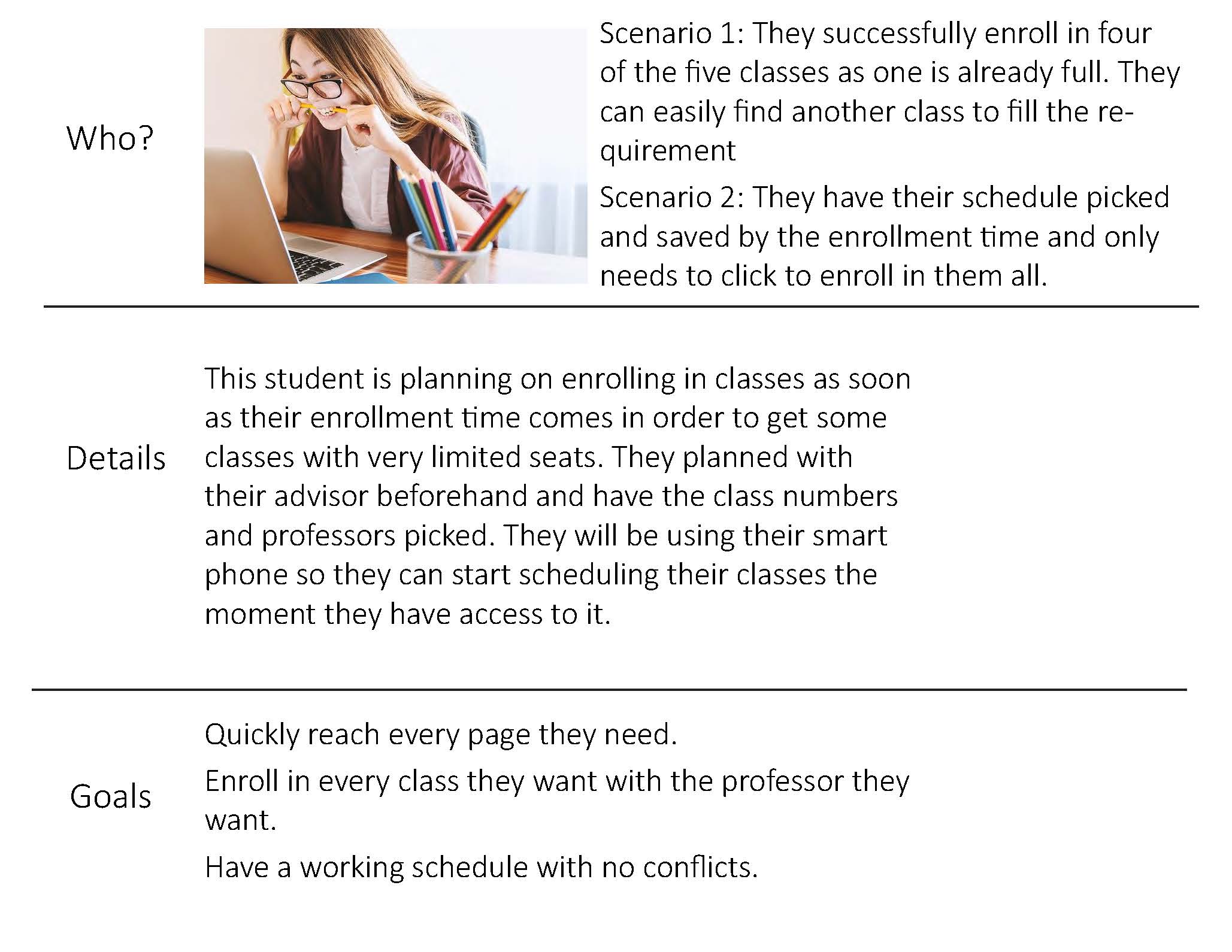
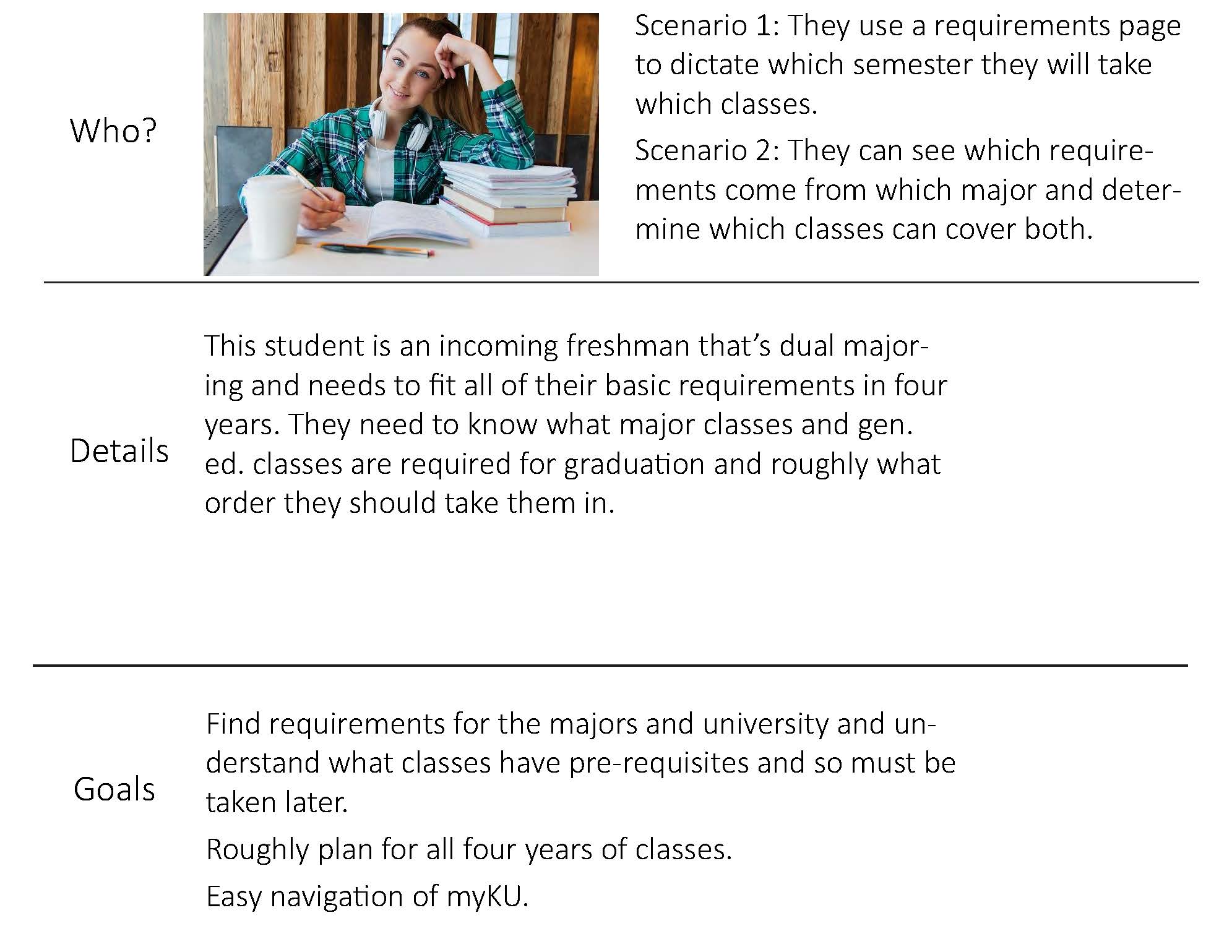
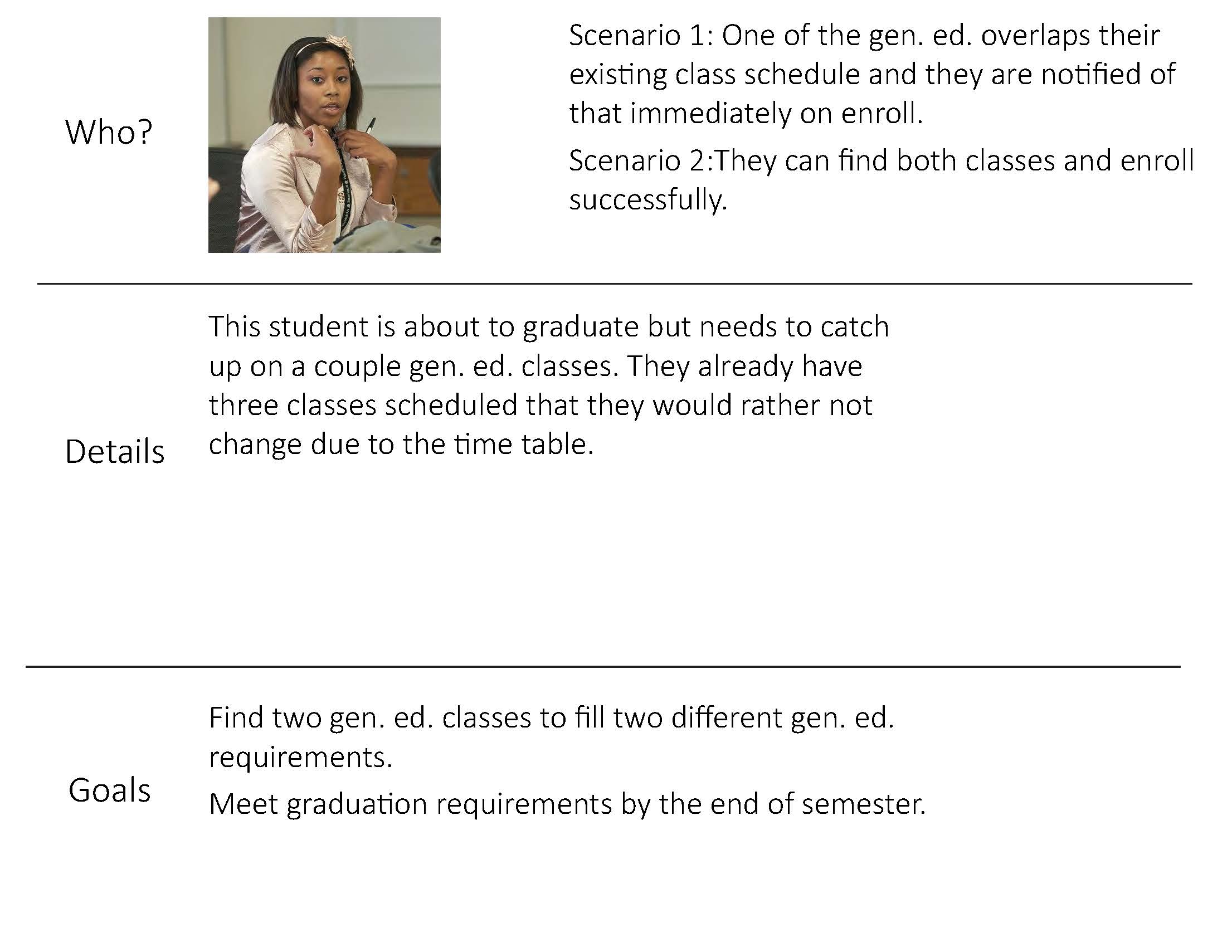
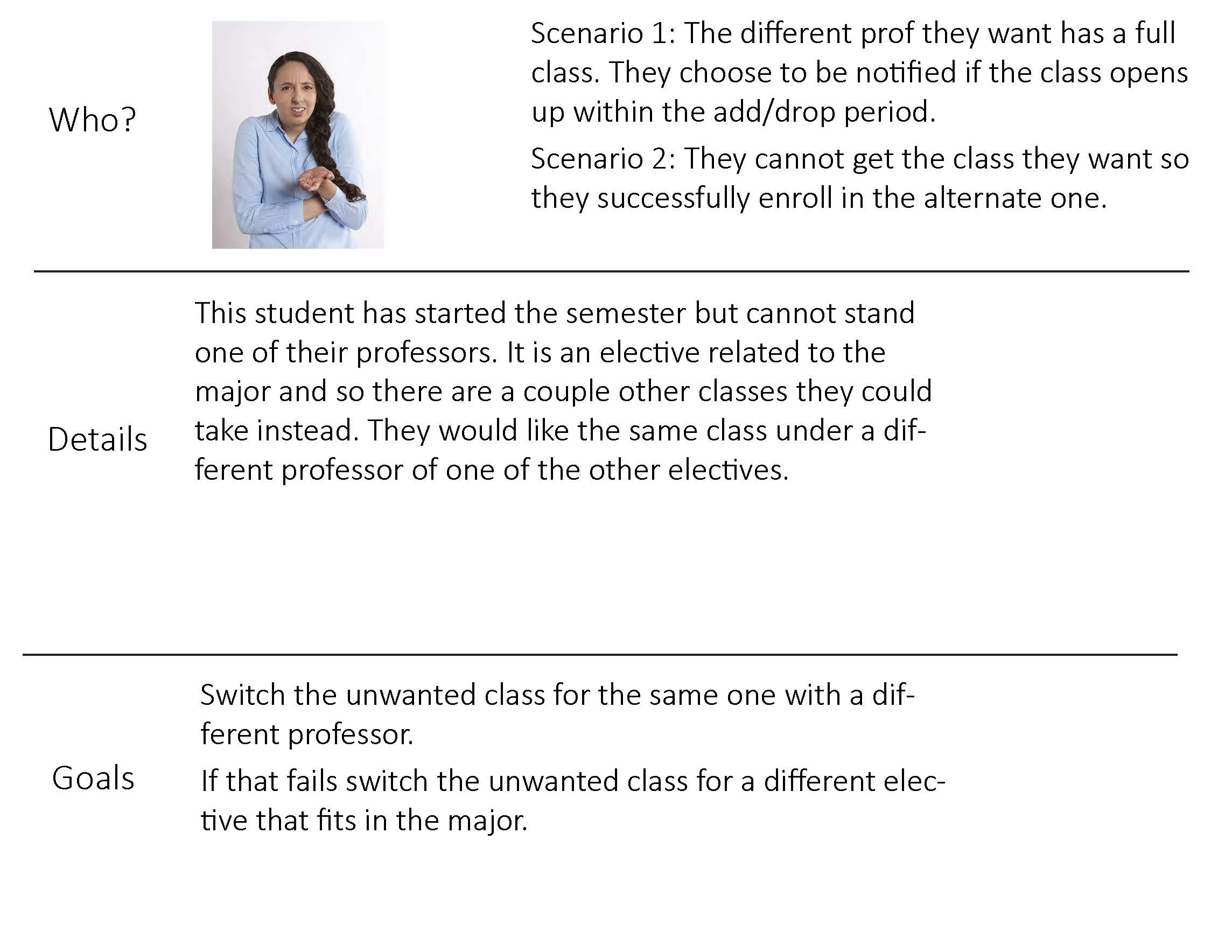
Personas

Revised Process Flow
.jpg)
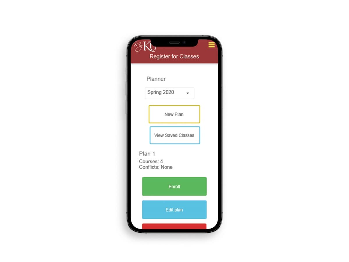
Planner to pick classes for current/next semester
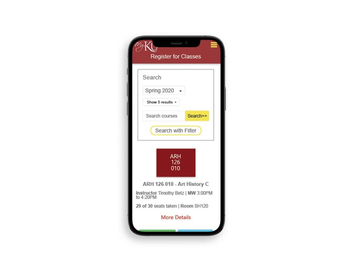
Add time, day, and prof filters in search and can exclude too
Multiple plans can be saved and can be enrolled in from planner view
Notification when attempting to add class that is closed or
Notification when attempting to add class that is closed or causes time conflict or other issue
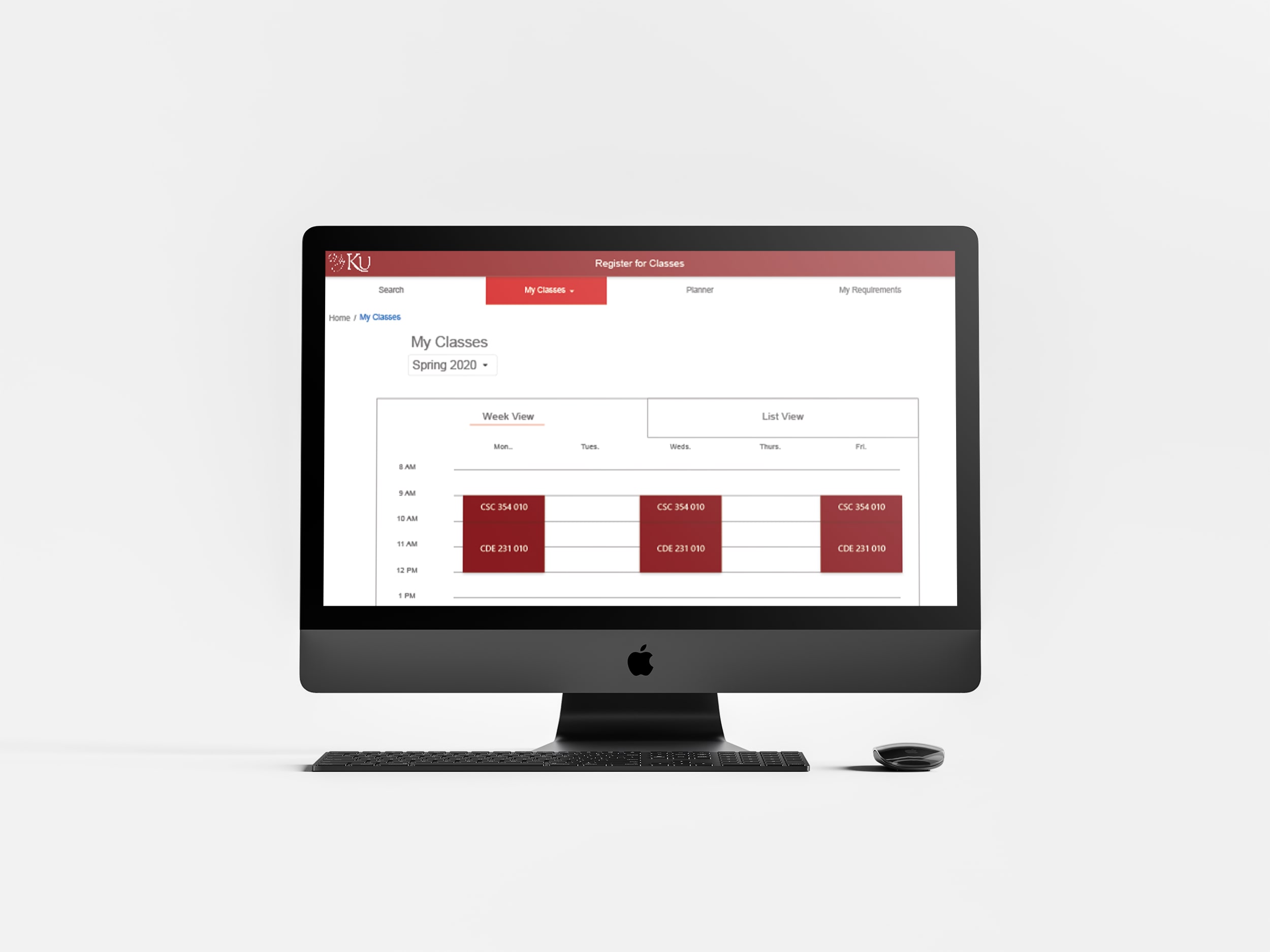
Can see week schedule
Back button to go back one and home to take to home
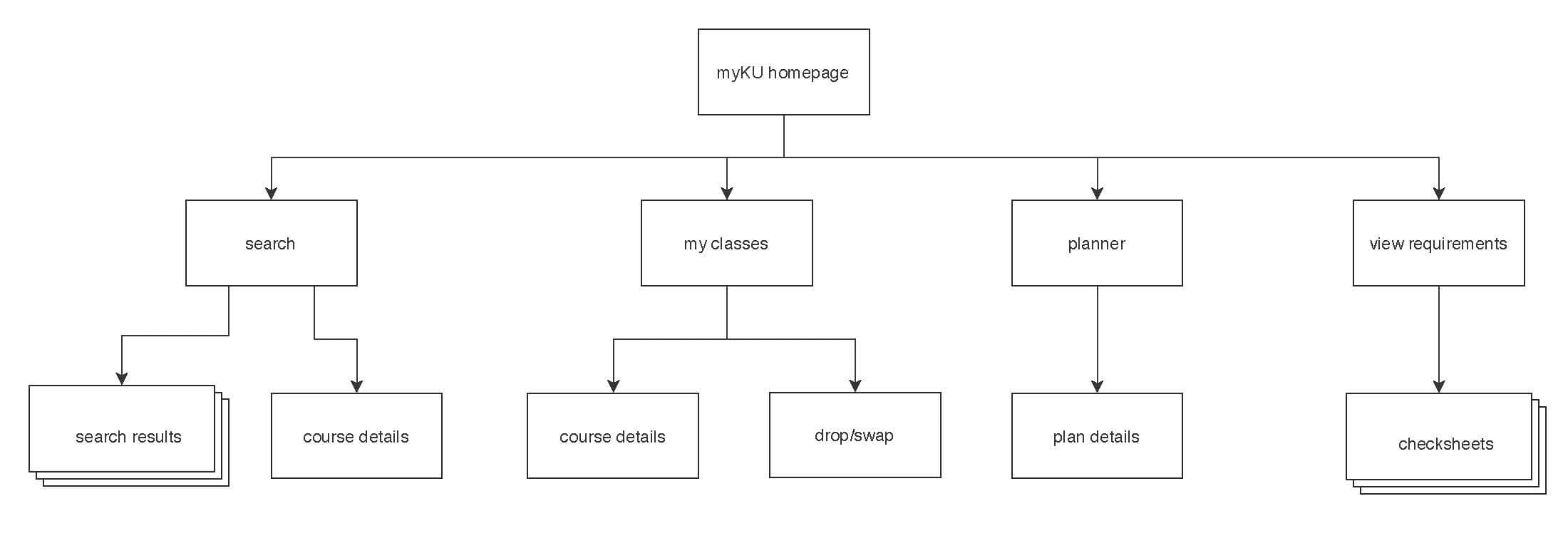
New Sitemap
Wireframes
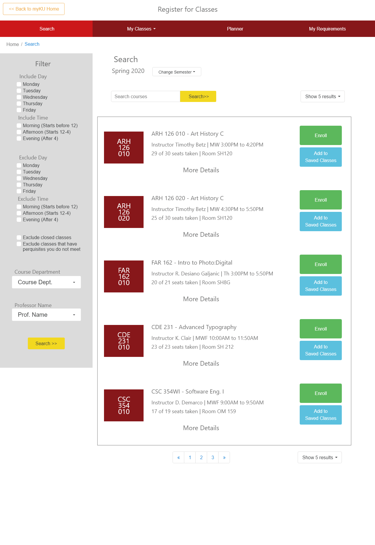
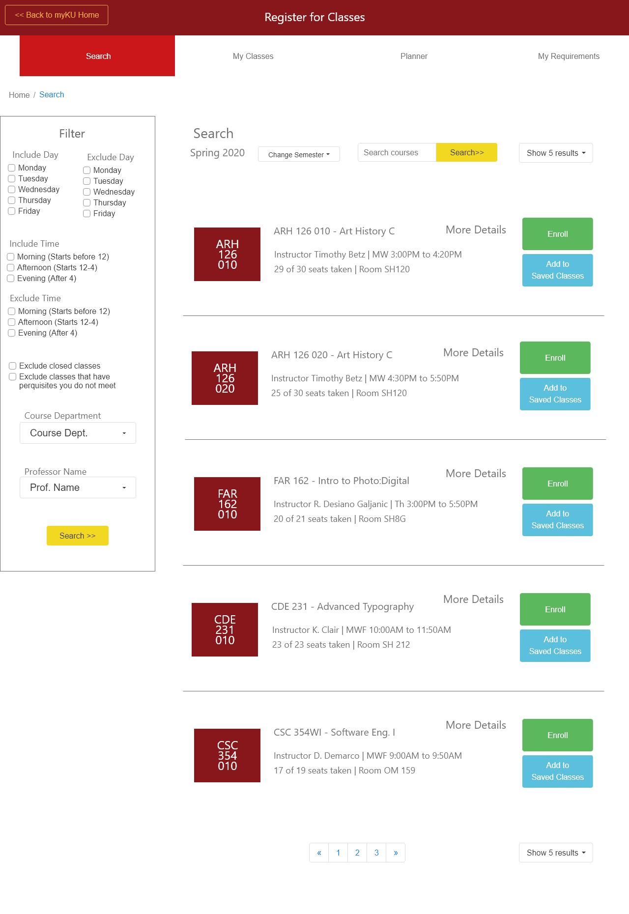

Desktop Prototype
Try out the desktop prototype by trying to view your classes, change a plan in your planner, or sign up for a class.
Mobile Prototype
Try out the mobile prototype of myKU by enrolling in a class, adding a class to your planner, or reviewing your requirements.